
Article
Building MUNE UX: A UX Pipeline Where Every Task Knows Why It Exists
How I designed and built a local-first tool that guides a project from discovery questions to a shipped release, traces every task back to a real user need, and what testing caught along the way.
Chapters
- 1. The Blank Canvas Problem
Why every UX tool I used left the thinking, and the connections, up to me.
- 2. Designing the Pipeline
Seventeen stages, three depths, and a loop instead of a line.
- 3. Traceability as the Core Promise
Why the links are computed from the data, not stored beside it.
- 4. Glass That Stays Readable
A glassmorphism design system with contrast rules, a light mode and an escape hatch.
- 5. Building With an AI Pair Programmer
Working from a spec with Claude Code, and keeping AI optional inside the product.
- 6. What Testing Caught
Driving a real browser through the spec found bugs that type-checking never would.
- 7. Making It a Desktop App
One shortcut, no console, and a server that stops when you close the window.
- 8. What I'd Do Next
Validating with real projects and closing the remaining gaps.
Chapter 1
The Blank Canvas Problem
Why every UX tool I used left the thinking, and the connections, up to me.
I run personal and freelance projects end to end, from research to code. For years my process lived in a scatter of tools: a Miro board for personas, a FigJam file for journeys, a Notion page for features, and a GitHub board for tasks. Each tool was good on its own. None of them knew about the others.
The cost showed up late. Halfway through a build I would look at a task and not remember which user problem it was meant to solve. The persona that justified it sat in a different app, and the interview answer behind that persona was in a third. Insights got lost between stages, and blank canvases didn't help me decide what to think about next.
So I wrote a specification for the tool I wanted. It starts every project with questions, not an empty template. Each stage's output feeds the next, and the whole chain stays traceable: answer, persona, journey pain point, problem, feature, user story, task, pull request, test, release and metric.
Chapter 2
Designing the Pipeline
Seventeen stages, three depths, and a loop instead of a line.
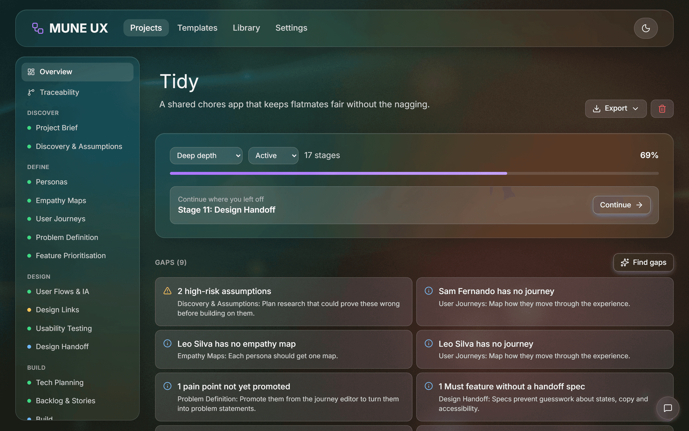
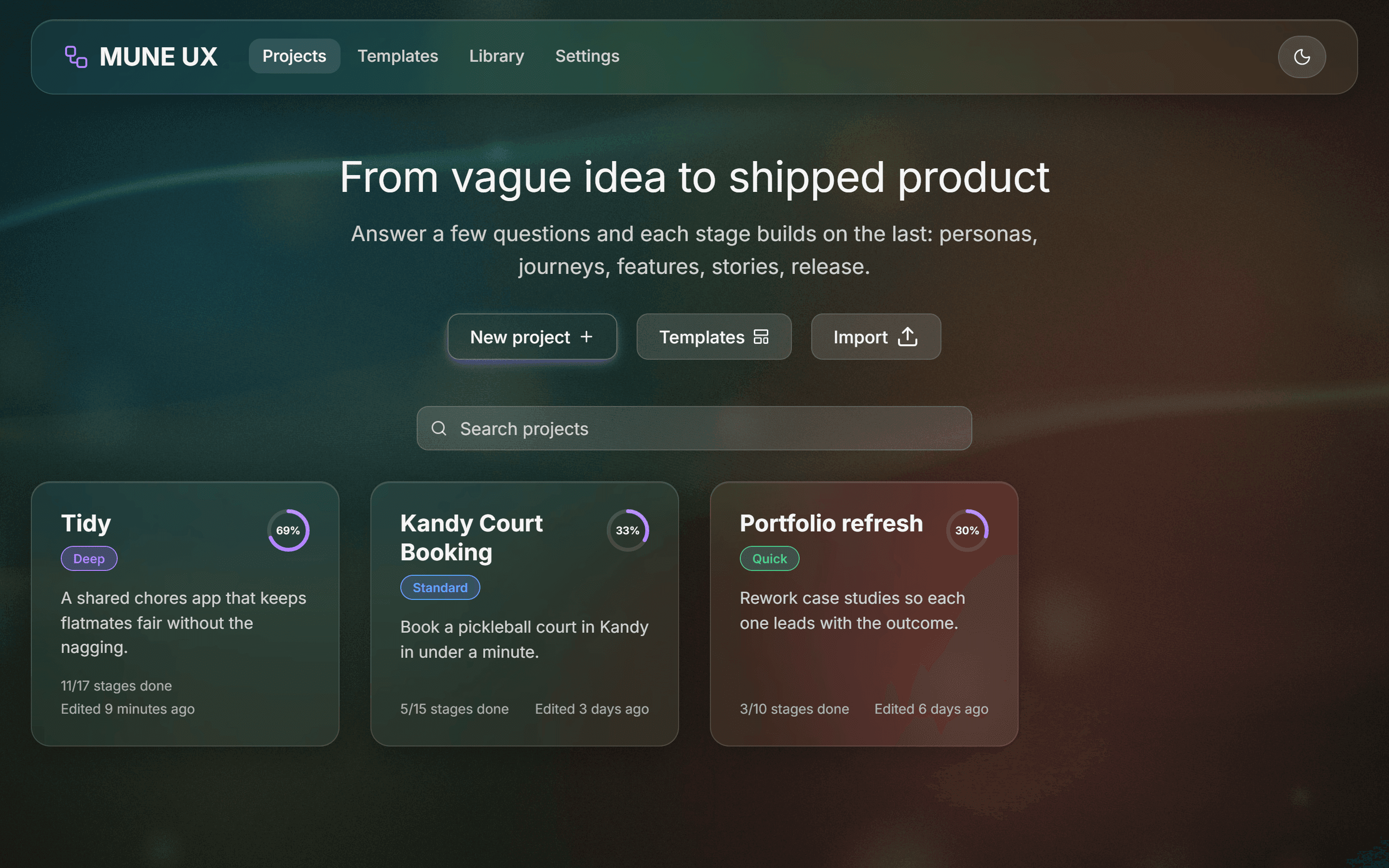
The pipeline has 17 stages grouped into six phases: Discover, Define, Design, Build, Ship and Learn. Not every project needs all of them, so each project picks a depth. Quick runs 10 stages, Standard runs 15, and Deep runs all 17. Stages can also be skipped, reordered or added back later. The app warns about gaps but never blocks you.
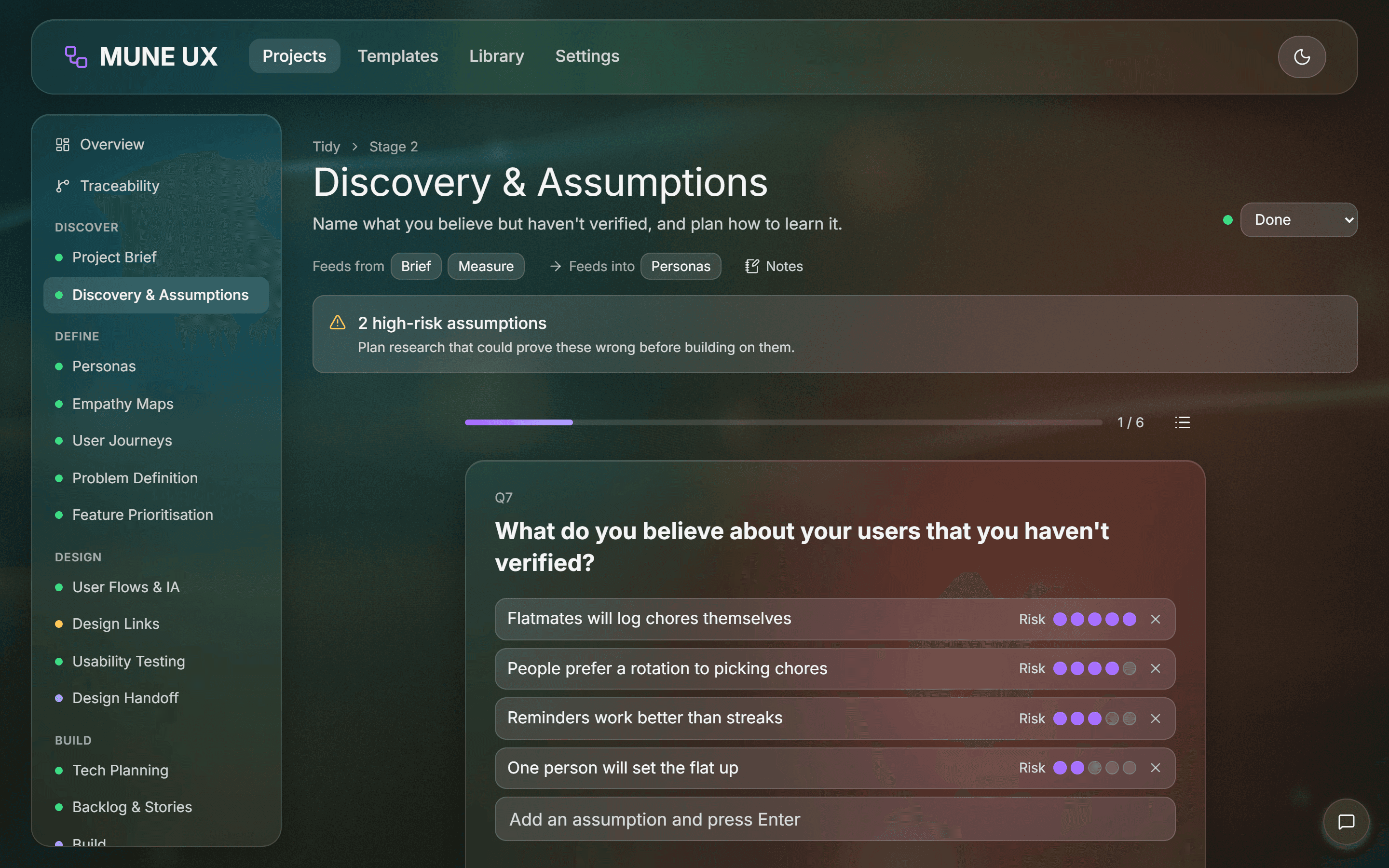
Discovery starts with 12 guided questions, one per card. Most of the work went into the question types. A plain text box wasn't enough for "What do you believe about your users that you haven't verified?", so that question became a list where each assumption gets a risk rating from 1 to 5. Anything rated 4 or 5 shows up as a warning until you plan research to test it.
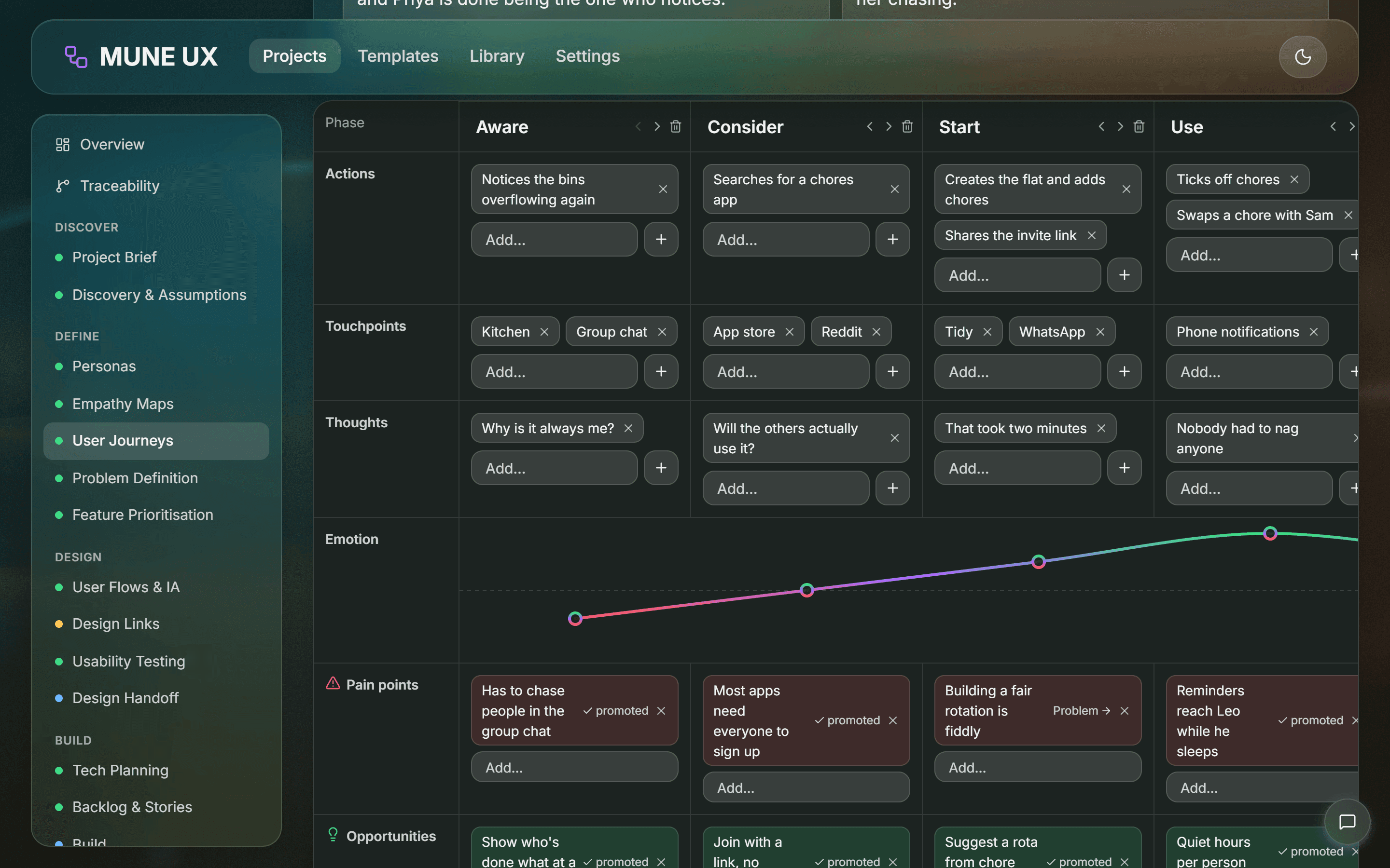
Each stage shows a "Feeds from" and "Feeds into" strip, so you always see where you are in the chain. Each stage also creates the next stage's raw material. Personas are drafted from the answers to "Who is it for?", "What problem does it solve?" and "What does success look like?". A pain point on a journey has a Problem button that turns it into a problem statement. An opportunity becomes a feature. Features become user stories, and each step of a user flow becomes a candidate Given, When, Then acceptance criterion.
The pipeline is a loop rather than a line. In the final stage, feedback is logged and sent back to Discovery as a new answer, and that starts the next round.
Chapter 3
Traceability as the Core Promise
Why the links are computed from the data, not stored beside it.
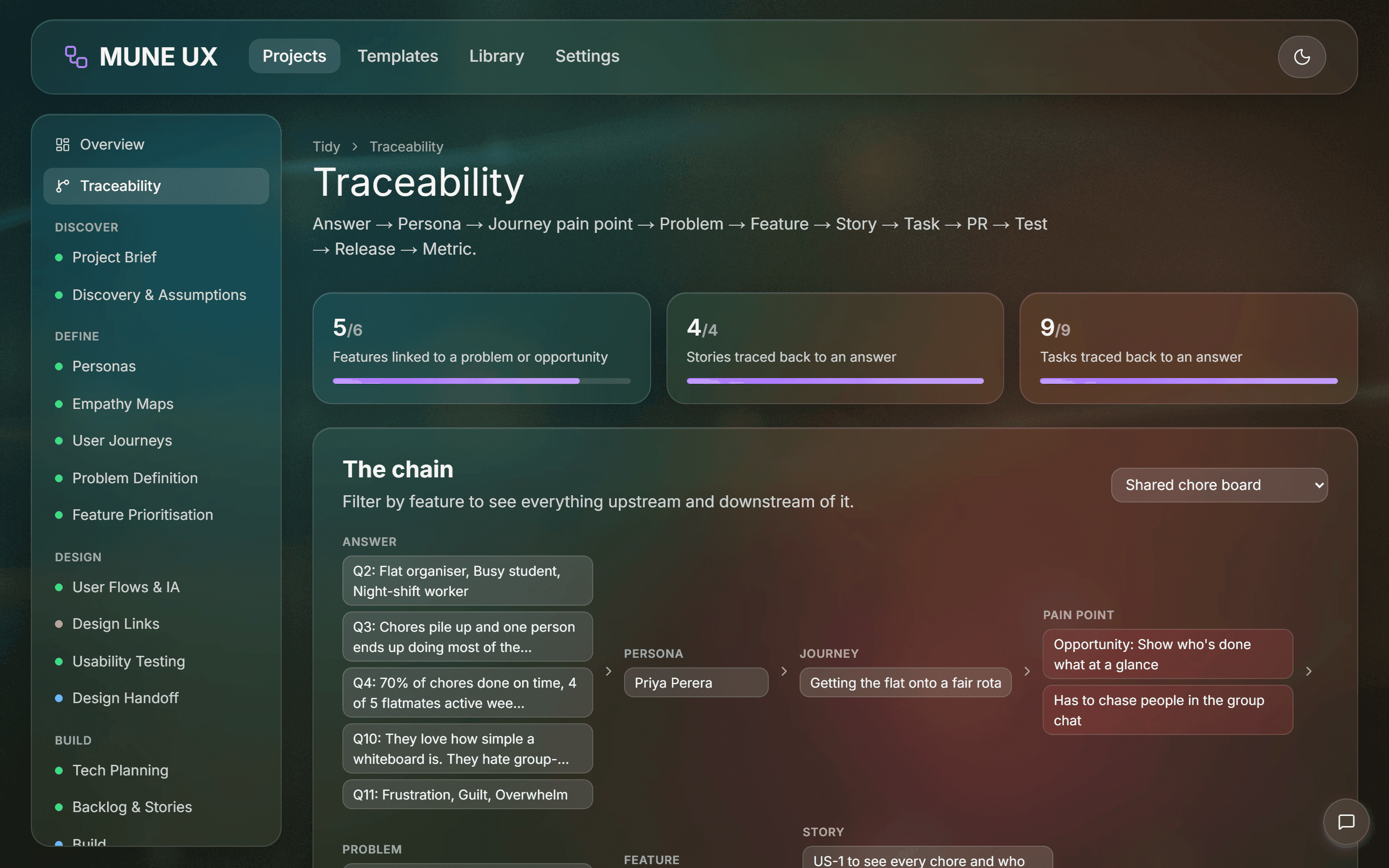
Traceability was the feature everything else had to serve, so I made an early architectural decision: don't store links as a separate list. Each entity already holds its own references. A persona lists the answers it came from, a problem lists the pain points it was promoted from, a feature lists its problems, a story points to its feature, a task to its story, and a release lists the stories it ships. The traceability graph is built from those references every time it's needed.
Because nothing is stored twice, the graph can't drift out of sync with the data. Deleting a feature removes it from every chain at once, with no cleanup step to forget.
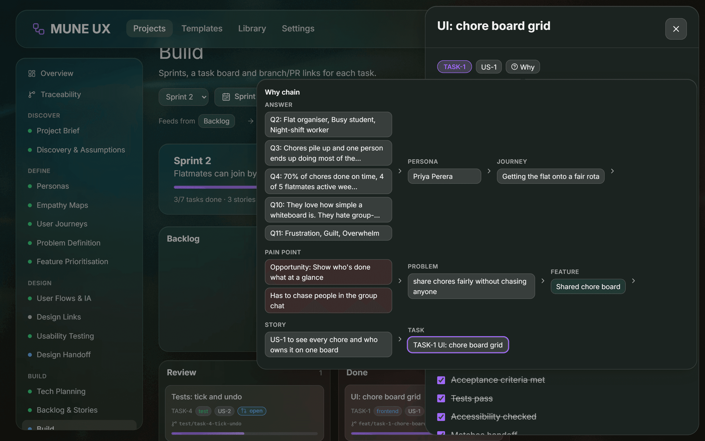
The same graph drives two views. The Traceability page shows the whole chain for any feature, along with coverage numbers such as how many stories trace all the way back to an answer. The "Why" popover on every story and task walks the chain upstream, so from a single build task you can see the story, feature, problem, pain point, journey, persona and the original answers that justified it.
Chapter 4
Glass That Stays Readable
A glassmorphism design system with contrast rules, a light mode and an escape hatch.
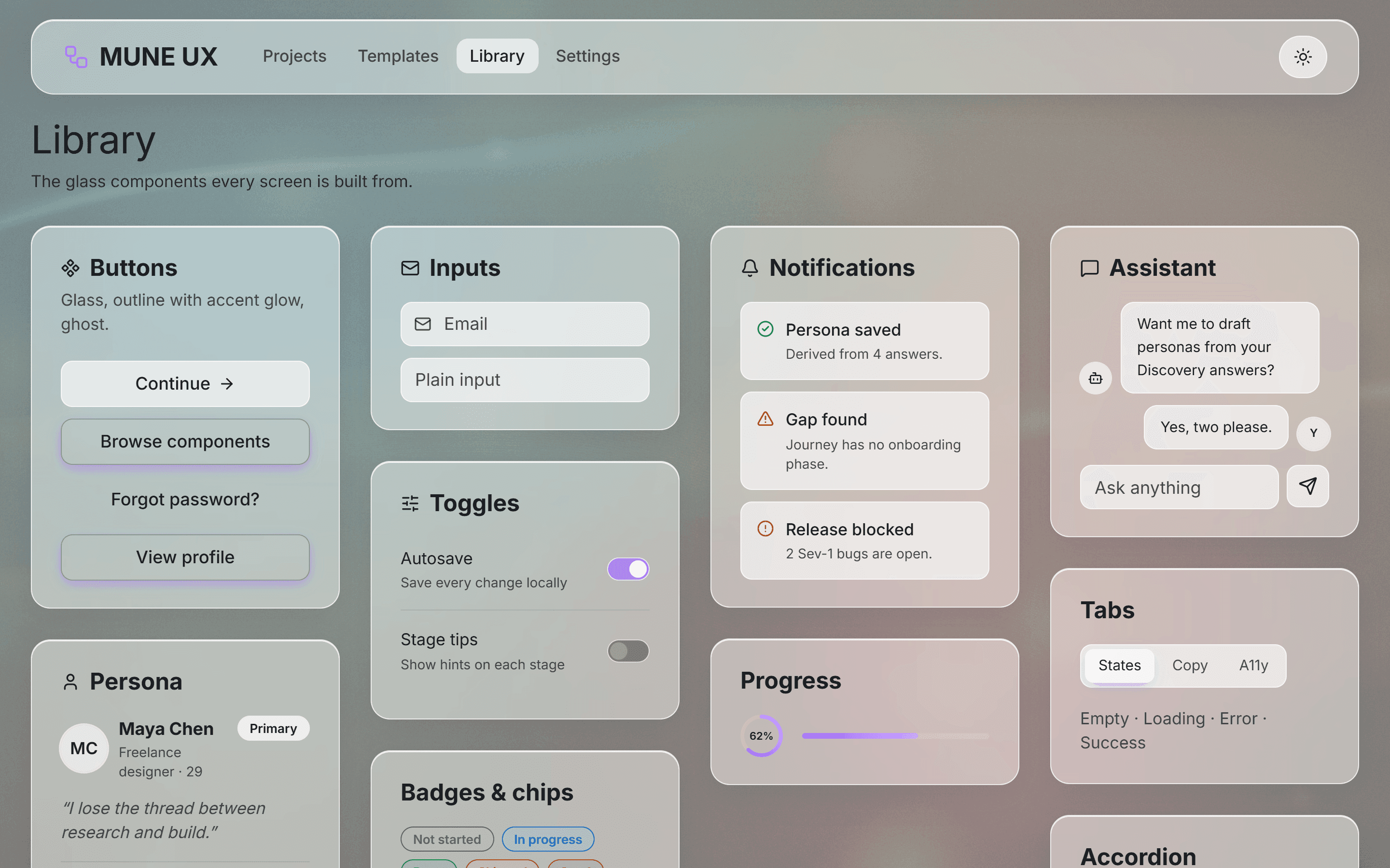
The visual language is dark glassmorphism: frosted translucent cards with soft white borders over a blurred, colourful background. Glass is easy to make pretty and hard to make readable, so the design system started with rules, not components. Body text never drops below roughly 4.5:1 contrast. Nested glass panels don't stack blur on blur, so a page never has more than two layers of blur. A "reduce transparency" setting swaps every glass surface for a solid one.
Every colour, radius, shadow and blur is a design token, and the components only use tokens. That made the optional light mode and the purple, blue and green accent themes almost free to add. On top of the tokens I built the component set: cards, buttons with an accent underglow, inputs, toggles, segmented controls, badges, chips, tabs, dialogs, side sheets, an accordion and progress rings. A Library page shows all of them in one place.
Glass needs something rich behind it, so the app has a full-screen wallpaper. I generated the default one in code, with soft aurora ribbons, glow fields, bokeh and film grain, in the same teal, moss, burnt orange and muted red palette as the spec. In Settings you can upload your own image and tune its blur and dim, or switch back to a CSS gradient.
Chapter 5
Building With an AI Pair Programmer
Working from a spec with Claude Code, and keeping AI optional inside the product.
I built MUNE UX with Claude Code as a pair programmer, working from the written specification. My role was product owner and designer: deciding scope, reviewing every screen, and pushing back when something didn't match the spec. The work went phase by phase: foundation and design system first, then each group of stages, then exports, AI, GitHub sync, and finally the desktop launcher.
The framework had moved on from what I knew. Next.js 16's Cache Components keep recently visited pages mounted in the background, so a dialog left open on one page would still be open when you came back. Every dialog and side panel now closes itself when its page is hidden. Pages that read URL parameters also have to render inside loading boundaries, or the build fails.
Inside the product, AI is strictly optional. It's off by default, and every AI feature has an offline equivalent: personas, stories and test cases can be drafted from your own data, gaps are detected by rules, and the changelog is generated from shipped stories. When AI is on, 10 structured tasks and a streaming assistant run through one server route. Each task asks Claude for JSON that matches a strict schema, the API key stays server-side, and anything the AI writes is marked ✦ until you edit or accept it.
Chapter 6
What Testing Caught
Driving a real browser through the spec found bugs that type-checking never would.
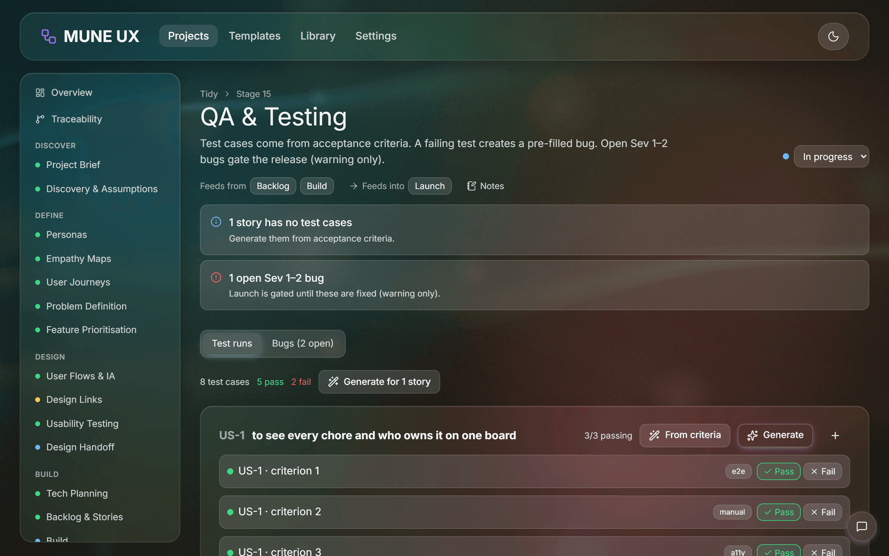
TypeScript, linting and a clean build said the app was finished. A real browser said otherwise. I wrote an end-to-end script that drives Edge through both acceptance checklists in the spec, 23 steps in all, from creating a project to exporting a changelog. It also takes screenshots, so I could review each screen.
The first run failed in a revealing way. I set two emotions on a journey in quick succession and only one survived. Both edits had written the journey's whole list of phases from a stale copy, so the second erased the first. The fix was a single helper that reads the latest saved version before writing, which now handles every list edit in the app.
The screenshots caught the rest: order (personas and stories reshuffled between runs, because random IDs set the storage order, and time-ordered IDs fixed it), accessibility (board cards nested one button inside another, which confuses screen readers, so keyboard dragging moved to a separate grip handle), and the glass itself (it had never actually frosted, because the CSS build kept only the Safari-prefixed blur property, which Chrome and Edge ignore, while a solid page background hid the backdrop entirely).
Two one-line fixes, and the design finally looked like the spec.
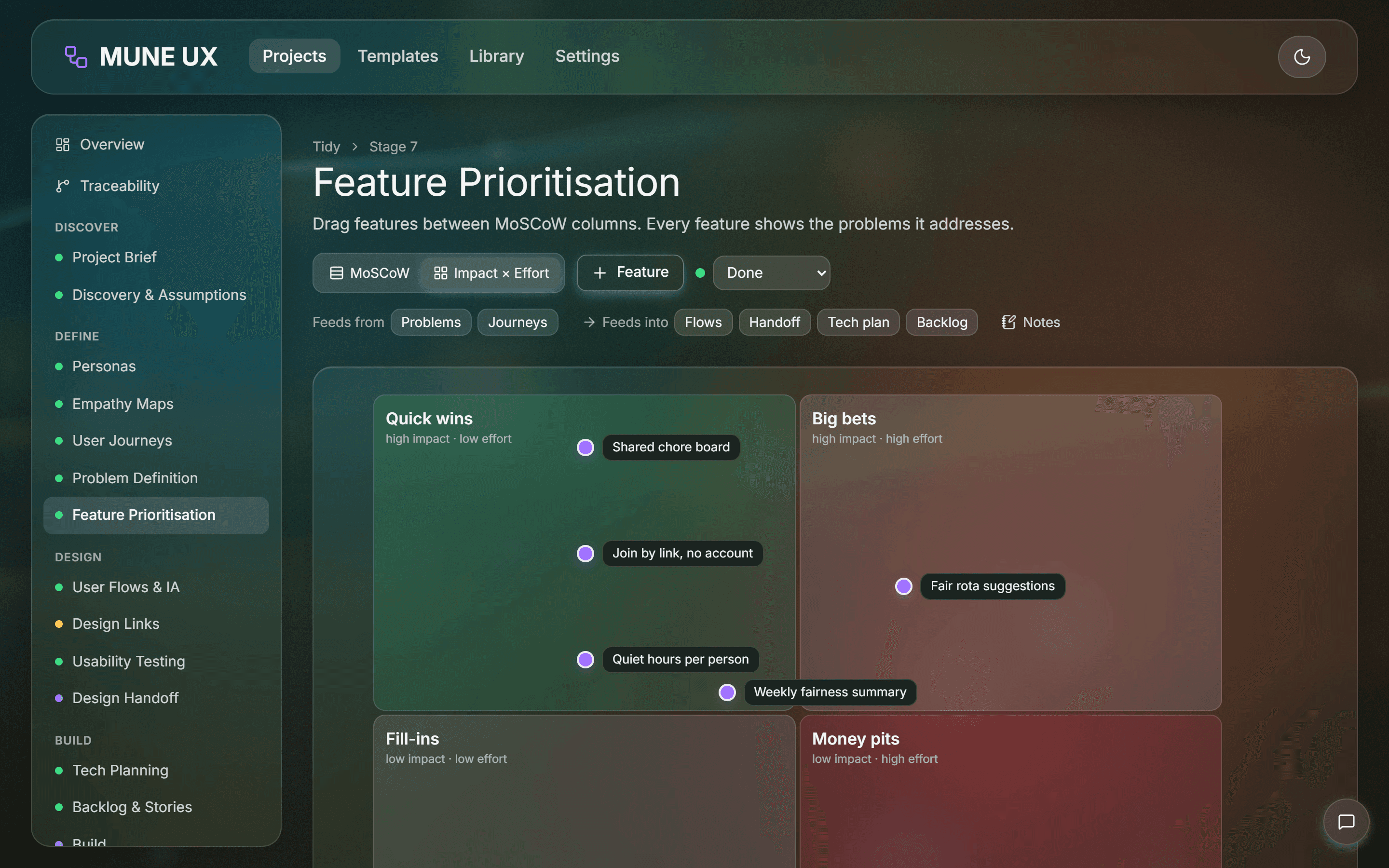
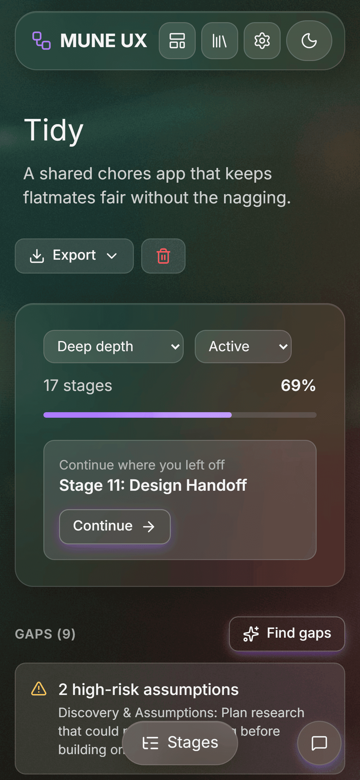
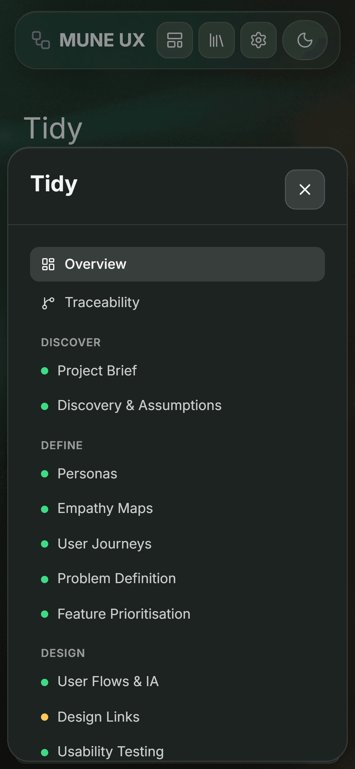
Even the portfolio screenshots found bugs. Capturing this set at 2× showed four problems: the impact and effort matrix had labels running into each other, with dots sitting exactly on the quadrant lines; long project titles were cut off; the phone-width nav wrapped onto two lines; and stories that named a persona read "As a Priya."
I fixed each in the app and re-shot the set. Now the screenshots are generated by a script, so they can be regenerated after any change.
The final run passes all 23 steps with zero browser console errors. I'm also clear about what's not verified yet: the AI features against the live API with a real key, GitHub sync on a private repository, and any testing with users.
Chapter 7
Making It a Desktop App
One shortcut, no console, and a server that stops when you close the window.
MUNE UX runs the same way as my other local tools, MUNE TASKS and MUNE Splits. A desktop shortcut starts a hidden script, which installs dependencies and rebuilds only when something has changed. The server starts on 127.0.0.1, and the app opens in a Chrome or Edge app window with no tabs or address bar.
The server lives only as long as the app. Every open window sends a heartbeat, and closing it sends a goodbye beacon. When the last window closes, the server waits a few seconds in case it was only a reload, then stops. A Quit button does the same immediately. Started any other way, for example during development, the server never shuts itself down.
Each app has its own port, so all three run side by side. Since the data lives in the browser's own storage for that address, everything is still there the next time the shortcut is opened.
Chapter 8
What I'd Do Next
Validating with real projects and closing the remaining gaps.
The tool is built but not proven. The next step is to run two real projects through it, one Quick and one Deep, and note where I skip stages, where the questions miss, and whether the traceability chains help when it's time to make decisions.
There are also specific gaps to close: AI (test the features against the live API, and compare drafts with and without AI on the same project), GitHub (sync with a private repository), backups (include uploaded wallpapers in the JSON backup), and phone (try IndexedDB data on a phone, since the layout already supports it).
Further out, the spec leaves room for multi-device sync. I deliberately left it out of version one to keep the tool local, private and fast.